Introducing Clever Design
We want Smart.pr to have a clever approach on design. We don’t want to be another clone. That's why we have formulated this system of guidelines, which makes sure everyone at smart.pr is able to speak our design language fluently.

Obvious
Good pr is human work, for everything else you use Smart.pr. We want our visual identity to deliver the same message.
Narrative
Every action should have a logical course of events. At any time the user should be aware of what stage of the process he or she is in.
Prioritize
Text, colors and shapes should guide the user’s eyes to the most likely to be taken next steps, and push neutral options and less relevant UI to the back.
Familiair
We keep it recognizable: A button should look like a button, a search field like a search field and a scroll bar like a scroll bar.


Coherent
We want the smart.pr app and the marketing channels to appear to originate from the same ancestor.
Unity
Regardless the part of the app we’re in, everything should work in a certain order and global manner. This logical and consistent design will create a peace-of-mind, allowing the user to be less distracted, thus make better use of the app.
Durable
The design needs to transcend the current state of mind of the time, company and market and be as usable in a couple of years as it is now.

Pleasant
As a lot of users use our app on a daily basis, the design of the app must be pleasant to work with.
Easy
Searching a certain contact or campaign should be easy and intuitive. Creating a campaign must feel natural and efficient, opposed to repetitive and clunky. This will most probably result in making choices rather than squeezing everything in one frame.
Feedback
Animated feedback of buttons should be appropriate. The difference of clicking 'cancel' or 'save' has to be noticeable. Also we have to provide the users with a celebratory feeling when a campaign is successful.
Elegance
We don’t want to over do it with unnecessary icons and lines when these defeat the purpose.
Clever Structure
Throughout the app and marketing page we use the same orderly fashion of layers. We emphasize these layers with colors, shadow effects and animations. We use this structure in the application views, pop-ups and full screen pop-ups.


Deferring action
A deferring action is an action that takes us to either another screen, or a pop-up over the current screen. For instance when when adding new content to a list, we open a full screen contact form. Also when we export a selection of recipients in a list, we show a pop-up where we have to approve the action.
#103849

#24586F

#126E95
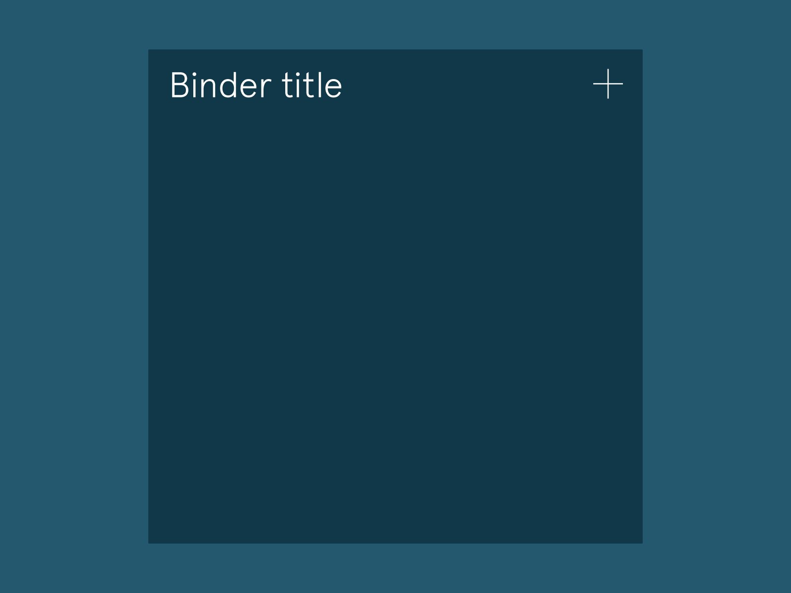
The Binder Principle
The binder represents a bundle of content. The type of content in a binder is always the similar. We have binders of all kinds and levels. There's a 'contact-list-binder', a 'contacts-binder' and a 'single-contact-binder'.
The layers in the binder have a particular order on the Z axis in 3D space. A Content Page lies on top of the Title Page that lies on top of the Binder which is lying on a desk.
The Desk
This represents the ground floor, the desktop as you will. The surface of the table or desk you're working at.
It provides us with navigation and information on the highest level possible in this particular view.
The Flyleaf
When we organise our papers in a binder, and we lay this binder opened up on a table, we see part of the inside of the cover sticking out around the content. With textbooks we call this inside a flyleaf, the pages that connects the book block to the cover.
The flyleaf provides us with information, controls and options that impact the contents of the entire 'binder'. Here we can search, filter and add content to the binder.
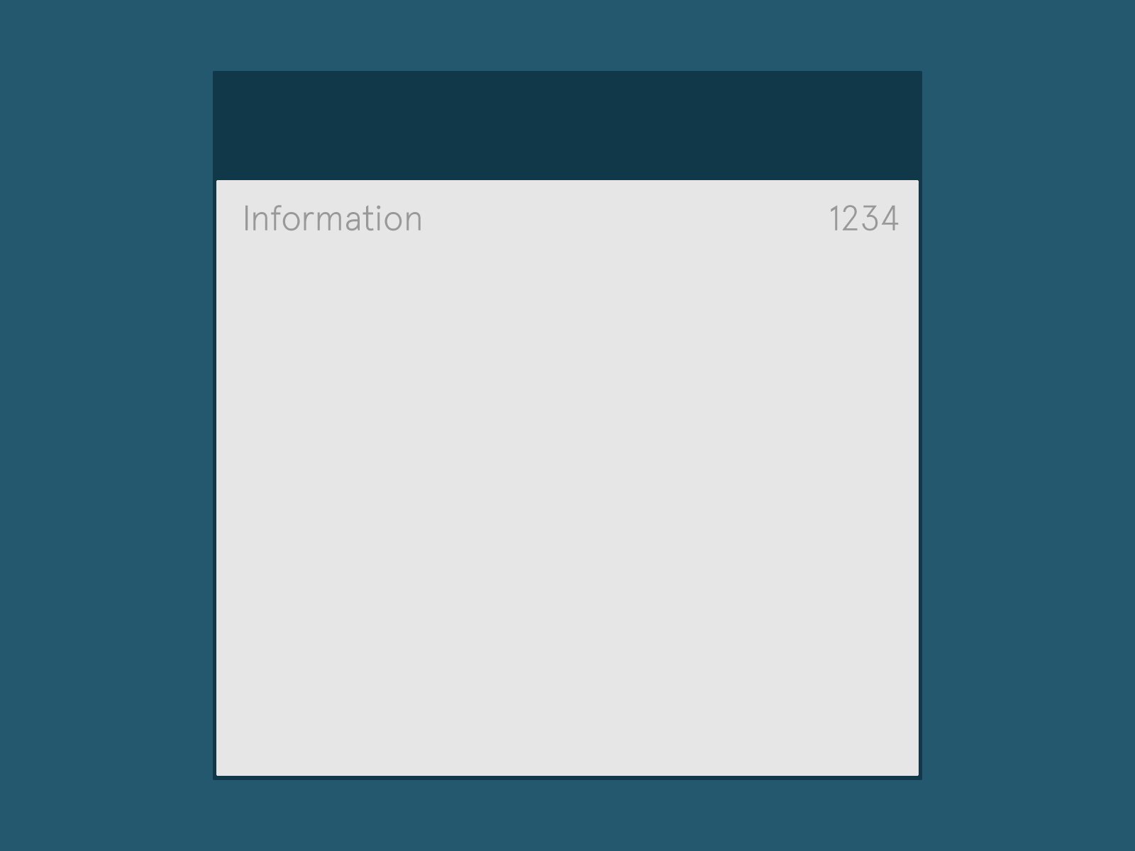
The Title Page
The title page often shows the title of the work, the person or body responsible for its intellectual content, and the imprint, which contains the name and address of the book's publisher and its date of publication.
It provides us with information on our list of content. Like the number of campaigns, contacts or lists. This information is subject to changes made in the search field or filter section on the flyleaf.
The Content Page
The content is what smart.pr is all about. Therefore, it should have the most prominent look and feel to it. The contrast of dark blue text on clear white paper will make it stand out just the way we intent to. Also the Name or titel of the content should me slightly heavier than the rest of the content, as this is the section we want the user to focus on.
Clever actions
We want all actions to have an obvious beginning and an clear ending. Within the app this sometimes means there are multiple steps in between. We want to provide the user with appropriate feedback on where he or she is within the process, and whether a decision has a certain impact.
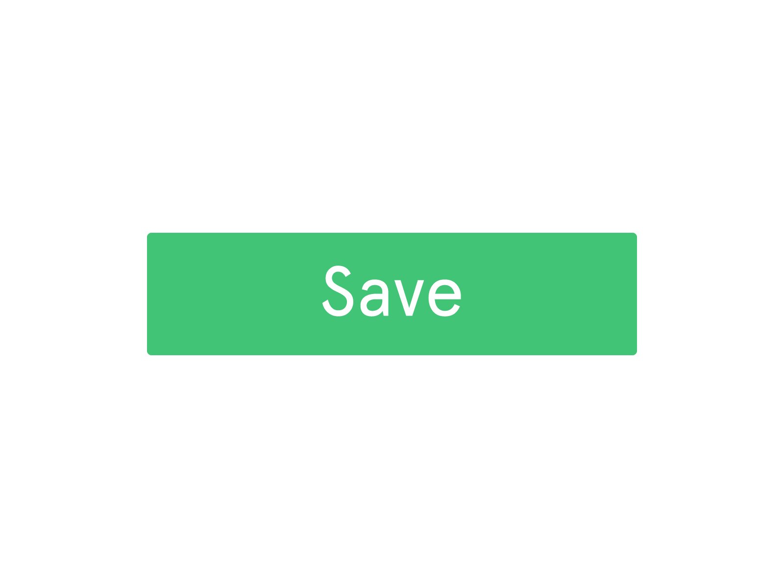
Final positive action
When we 'save' or 'send' something, it has impact on our content. We must make sure the action is accompanied by appropriate feedback. We aim to achieve this with the color, animation and at times a relevant illustration.

Primairy actions
On every page or section there are some prominent action we can take. We must make sure these actions are always easy to find. For these actions we use a bright green or bright blue to make them stand out.
Neutral actions
The neutral actions within the application should be clear but don't have to stand out that much. We have to make sure they don't distract the users. A thin cross in the corner closes the pop-up, the cancel button is just slightly less dark blue as the Flyleaf.
Clever colors
We want Smart.pr to feel obvious, coherent and pleasant. Clarity comes from the contrast of colors, coherence from assigning corresponding colors throughout the app and website. Pleasure comes from both ease of use and general look and feel, so here the choice of color is important.
For the app we strive to achieve a look that's easy on the eye, and we want to use colors that convey our clever approach on webdesign. To emphasize this the color scheme has been revived to a slightly brighter and more saturated palet.

#FCC448
#FFFFFF

#F3F3F3

Final negative action
We don't want users to accidentally 'delete' something, because of its negative impact on our content. We must make sure the action is accompanied by appropriate feedback such as the color red.

#27B2E7

#41C476

#F15A3A